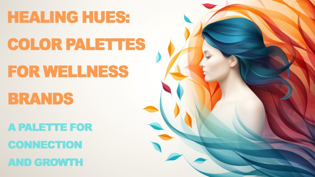
In the vast continuum of healthcare branding, color holds a power that transcends the mere act of beautification. It’s a silent yet potent communicator, a subtle influencer on perception, and a gentle guide in the customer journey within the wellness industry. Far beyond aesthetics, color psychology in branding taps into the primal, evoking feelings and setting the stage for healing and balance. This article explores the nuanced role of color in wellness brands and how it shapes consumer experiences, trust, and preference.
The Basics of Color Psychology in Wellness
Understanding color psychology is pivotal for any brand, but for those in the wellness sector, it is an indispensable tool. Colors aren’t just seen; they’re felt. They interact with human emotions on a primal level, often beyond conscious awareness. Color can soothe or stimulate, depress, or delight. It can evoke the warmth of a summer’s day or the stark chill of a hospital corridor. For wellness brands, this emotional dialogue between color and consumer can spell the difference between engagement and indifference.
Color Associations and Their Meanings
Each hue carries its own story and set of associations. Red, often seen as a beacon of vitality, can also signal danger and is used sparingly in wellness spaces. Blue, the color of the sky and sea, universally breathes calm into a room. It’s the healthcare industry’s darling, symbolizing trust and professionalism. Green, the earth’s color, signifies growth and harmony, a natural choice for brands rooted in organic and natural health solutions. Understanding these associations is crucial for wellness brands aiming to communicate their ethos effectively.
Section 1: Colors and Their Influence on Wellness
Diving deeper into the color spectrum, we explore the distinct influences of both warm and cool colors in wellness branding.
Warm Colors: Energy and Comfort
Red, the color of fire and blood, is a double-edged sword in wellness. Its energy can invigorate, but its intensity must be tempered. Brands use it sparingly to highlight critical elements but avoid it in spaces meant for relaxation. Orange, softer and more inviting, is the social color, often found in brands promoting community and lively interaction, such as fitness clubs. Yellow, the brightest color perceptible to the human eye, is synonymous with joy and alertness. It’s utilized to create an atmosphere of optimism in wellness spaces.
Cool Colors: Tranquility and Health
On the cooler side of the palette, blue is the quintessential healer. Its prevalence in healthcare is no accident; it’s trust in color form, offering a serene backdrop for patient care environments. Green, sitting in the middle of the spectrum, is the balancer. Its use in wellness branding speaks of a connection to nature and an invitation to growth and rejuvenation. Purple, once the color of royalty, brings a touch of luxury and spirituality to wellness brands. It’s often employed to signify the premium and esoteric aspects of holistic health.
Section 2: Creating a Color Palette for Your Wellness Brand
The creation of a color palette should begin with a deep dive into the brand’s identity. What is the mission? Who are the customers? The answers to these questions will inform the hues that will become the visual voice of the brand. Harmony in color combinations communicates cohesiveness and intention. It’s not just about individual colors, but how they work together to convey the brand’s message.
Starting with Brand Identity
Identifying the core values and mission of a wellness brand is the first step toward selecting a color palette that truly represents it. Whether the focus is on energetic fitness, serene spa services, or holistic health, the colors chosen must align with the brand promise and resonate with the intended audience.
The Psychology of Color Combinations
The art of combining colors is as important as the choice of the colors themselves. Complementary schemes, where colors from opposite sides of the color wheel are paired, create vibrant looks full of energy. Analogous schemes, using colors next to each other on the wheel, offer harmony and tranquility. Successful wellness brands use these principles to design palettes that speak clearly to their customers’ desires for health and well-being.
Case Studies: Successful Color Palettes in Renowned Wellness Brands
Examining leading wellness brands reveals a pattern of deliberate and strategic color choices. Each brand’s palette is a careful curation meant to invoke specific responses and align with the brand’s core values. These case studies provide valuable insights into effective color strategy in the wellness industry.
Section 3: Implementing Your Color Palette Across Various Platforms
Once a palette is chosen, consistent application across all touchpoints is essential for brand recognition and customer experience.
Digital Presence
The digital realm is often the first interaction a potential customer has with a wellness brand. Here, color must function to not only attract but also to facilitate navigation and content absorption. Websites must balance beauty with usability, leveraging color to direct attention and convey information hierarchies.
Physical Spaces
In the realm of bricks and mortar, color transforms spaces into experiences. The hues chosen for a wellness center, spa, or store have a profound impact on how customers feel and behave within the space. Colors can relax or energize, welcoming clients into an environment that supports their wellness journey.
Marketing and Advertising
The strategic use of color in marketing materials can enhance brand recall and emotional connection. Through advertising campaigns, promotional materials, and even merchandise, color reinforces the brand’s presence and facilitates a cohesive narrative across all channels.
Section 4: Trends and Innovations in Color and Wellness Branding
As wellness brands evolve, so do the color palettes that represent them. Staying abreast of trends while being mindful of timeless principles of color psychology ensures a brand remains relevant and resonant.
Current Trends in Color Palettes for Wellness
Today’s wellness brands are embracing earth tones and nature-inspired colors, reflecting a growing consumer desire for authenticity and environmental connection. At the same time, bold colors are emerging in modern wellness brands targeting younger demographics, symbolizing a break from tradition and a nod to innovation.Future-forward: Sustainable and Mindful Color Choices

Looking ahead, sustainability and cultural sensitivity in color choices will become increasingly important. As the global landscape changes, so will the colors that brands use to communicate with their audiences.
The Future of Wellness: Color Trends and Brand Identity
As wellness brands look to the future, they must anticipate and adapt to changing consumer expectations and the evolving cultural landscape. Color, as an integral part of brand identity, will continue to play a critical role in this adaptation process. To remain ahead, brands will need to be not only trend-aware but also trendsetters in their use of color to convey their unique message and ethos.
Evolving with Consumer Expectations
Today’s consumers are more informed and more demanding than ever before. They seek brands that align with their values and lifestyle choices. As a result, color palettes in wellness branding are shifting to reflect these evolving expectations. For instance, a surge in demand for mindfulness and meditation apps has prompted a rise in the use of tranquil blues and greens, which are thought to aid concentration and calmness.
Cultural Sensitivity and Inclusion
In an increasingly global marketplace, wellness brands must also consider cultural perceptions and the universal language of color. What resonates in one culture may have a completely different impact in another. For example, while white may represent purity and cleanliness in Western cultures, it is often associated with mourning in some Eastern cultures. Brands that demonstrate cultural awareness and sensitivity in their choice of colors will be better positioned to connect with a diverse customer base.
Sustainability in Color Selection
The drive for sustainability is also influencing color choices. As consumers become more environmentally conscious, they are drawn to brands that use natural and earthy tones, symbolizing a commitment to eco-friendliness. This trend is seeing a resurgence of greens and browns in wellness branding, hues that speak to nature and organic living.
Innovation in Color Technology
Advancements in color technology are opening up new possibilities for wellness brands. For instance, biophilic design principles, which emphasize the connection between nature and well-being, are being enhanced by innovative uses of color in physical spaces to mimic natural environments. Additionally, digital color tools are allowing for more personalized and adaptive color experiences, aligning with the personalization trend in wellness.
Maintaining Timelessness Amidst Trends
Despite these trends, the challenge for wellness brands is to remain timeless. The colors chosen should not only be fashionable but should also stand the test of time. A well-designed color palette strikes the right balance between being current and enduring, ensuring that the brand remains relevant both today and tomorrow.
Integrating Color into the Total Brand Experience
In the end, the power of color in wellness branding is realized when it is integrated seamlessly into the total brand experience. This means consistent application across all consumer touchpoints, from product packaging to digital interfaces, to interior design.
Packaging and Product Design
The first physical touchpoint between a brand and a consumer is often the product packaging. Colors here must not only attract attention but also communicate the product’s purpose and the brand’s philosophy. For example, a wellness brand that emphasizes organic ingredients might opt for muted tones and natural textures in its packaging design, which convey purity and simplicity.
Interior Design of Wellness Spaces
The colors used in the interior design of wellness centers, spas, and even retail locations have a profound impact on the customer experience. They should create an environment that encourages relaxation, healing, and well-being. The strategic use of color can help guide customer flow, delineate different areas, and even affect the perceived temperature of a room.
Digital and Social Media Branding
In the digital realm, consistency in color across platforms is essential. The same tones should be found on a brand’s website, social media profiles, and digital advertising. This consistency helps to reinforce brand recognition and ensures a coherent brand story.
Training and Internal Brand Culture
Finally, the brand’s use of color should also permeate its internal culture. Employees should be trained to understand the brand’s color philosophy, ensuring that they are not only brand ambassadors externally but also embody the brand ethos in their everyday interactions.
The Strategic Use of Color in Wellness Campaigns
Well-executed marketing campaigns can leverage color to create emotional connections and prompt action. Seasonal campaigns, for instance, can use color palettes that reflect the mood of the season while aligning with the brand’s core colors. Limited-edition products or services can also utilize unique colorways to signify exclusivity and novelty.
Accessibility and Universal Design
An important consideration for wellness brands is the accessibility of their color palettes. This includes ensuring that there is enough contrast for those with visual impairments and considering how color-blind individuals perceive colors. Universal design principles guide brands in choosing color combinations that are inclusive and accessible to all.
Conclusion
In wellness branding, color is much more than a design choice; it is a strategic tool that can engage, soothe, and inspire. The colors a brand chooses are the silent ambassadors of its values and promises. They can create a sanctuary for healing or a beacon for energetic transformation. As wellness brands continue to navigate the dynamic landscape of consumer preferences and global trends, their color palettes must remain agile yet anchored in the timeless principles of color psychology.
By understanding the emotional, cultural, and psychological impact of color, wellness brands can craft color palettes that resonate deeply with their audience, fostering a brand experience that truly enhances wellbeing.