In the vast sea of branding, a logo acts as a beacon, guiding potential clients and patients toward healthcare providers they can trust. The creation of a logo, especially in the healthcare industry, goes far beyond a simple design task. It is a deep dive into the psychology of colors, the subtleties of typography, and the power of symbolism. These elements come together to form not just a recognizable mark but a symbol of hope, health, and care for patients and a badge of credibility and professionalism for providers.
Understanding the Psychology of Colors in Health Logo Design
Colors speak a silent, potent language, understood instinctively across the globe. The palette chosen for a health logo carries a subconscious weight, communicating values and emotions even before a single word is read or a service is experienced. This section of the article will delve into the intricacies of color theory, exploring the warmth of oranges, the cool reassurance of blues, and the clean neutrality of whites. Each hue sings a different note in the symphony of trust and professionalism essential to healthcare branding.
For example, blue is pervasive in healthcare branding. It’s the color of calm skies and clear waters, symbolizing serenity and trust. It reassures us with its suggestion of stability and depth. Green, another popular choice, whispers of growth and vitality, often used to signify natural and holistic care. Red, while less common due to its intensity, can be employed to convey urgency or passion, often found in logos related to heart health or blood services.
However, the psychological impact of color is not universal. Cultural variations must be considered. While white is often associated with purity and cleanliness in many Western societies, it can signify mourning and death in some Eastern cultures. This cultural color literacy is paramount in designing health logos that speak a global language while respecting local dialects of color perception.
Symbolism and Its Impact on Health Logo Imagery
A picture is worth a thousand words, and in the realm of logos, the right picture can be priceless. Health logos often leverage symbols that evoke the field’s noble vocation: the caduceus, the Red Cross, and the heart are symbols woven into the collective consciousness, each carrying deep associations with healing and care. Yet, the challenge lies in balancing the literal representation of such symbols with a degree of abstraction that allows for uniqueness and brand distinction.
Case studies in successful health logo design showcase a dance between simplicity and evocation. The logo for the World Health Organization, for instance, features a serpent-entwined rod, drawing on the ancient symbol of the Rod of Asclepius, representing healing and medicine. This symbol, in its stylized form, communicates a global commitment to health. Analyzing such case studies provides insight into how symbolism, when expertly applied, can elevate a healthcare brand and embed it in the visual vernacular of its audience.
Typography in Health Logos: Conveying Reliability and Care
The typographical aspect of a health logo is where the art of subtlety meets the science of legibility. The choice of typeface can drastically affect the logo’s message. Serif fonts, with their decorative “feet” at the ends of letters, often carry a traditional, trustworthy vibe. On the other hand, sans-serif fonts present a cleaner, more modern feel. But the choice between serif and sans-serif goes beyond aesthetics; it speaks directly to the heart of the brand’s identity.
In the context of healthcare, typography must never sacrifice clarity for style. Readability remains paramount, as a health logo often appears on signage, prescriptions, and other critical communications where legibility can be a matter of life and death. Yet, within these parameters, there is room for creativity. The curves of a letter, the weight of a stroke—each typographical decision can subtly reinforce the notions of care and professionalism that are the hallmarks of a quality healthcare provider.Balancing Simplicity with Complexity

Minimalism has made its mark on the design landscape, and health logos are not immune to its charm. The lure of simplicity lies in its clarity and memorability. Yet, simplicity in design is anything but simple. It requires distilling complex ideas and values into an essence that can be instantly recognized and associated with the brand.
However, there are times when complexity has its place in health logo design. When representing multifaceted organizations or conveying a broad spectrum of services, a logo may require multiple elements to tell its story. The trick lies in not letting complexity clutter the core message. Negative space, the ‘empty’ area around and between the subject of an image, can play a pivotal role in this aspect of design. It can create secondary images that tell a deeper story, like the famous hidden arrow in the FedEx logo, or the ‘smiling face’ of Amazon’s arrow. In health logos, such clever use of space can intrigue and invite potential clients to look a little closer.
Designing for Different Healthcare Sectors
The healthcare sector is vast and varied, encompassing everything from hospitals to specialist clinics, from general practices to alternative medicine providers. Each sub-sector has its unique branding needs and audience expectations. Hospital logos often need to communicate a wide range of services and a promise of general care to a diverse audience. In contrast, specialist clinics might opt for logos that highlight their expertise in a particular field, such as a neurology practice incorporating a stylized brain into their design.
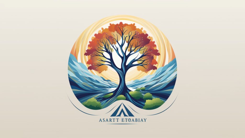
Wellness brands and alternative medicine take a different route altogether. Here, the design might lean towards more organic shapes, earthy colors, and imagery that reflects a holistic approach to health. These logos tend to eschew the more clinical look of traditional healthcare branding, instead embracing designs that signal a departure from the mainstream and a commitment to natural care.
The Design Process: From Concept to Completion
Embarking on the design journey for a health logo is to understand deeply the brand’s essence. It is to distill the core values, mission, and vision of the healthcare provider into a visual form. This part of the article will walk the reader through the entire creative process, from the initial research and understanding of the brand’s ethos to the ideation phase where concepts begin to take form.
Sketching, the fundamental act of bringing ideas to paper is the first step in making the intangible tangible. It allows for a free-flowing exploration of possibilities without the constraints of digital tools. Once a promising direction is chosen, the design moves into the digital realm, where precision and refinement take center stage. Here, the article will offer best practices and considerations for this critical phase of design, ensuring that the final logo not only looks good but is also versatile and scalable across various media.Testing and Refining the Health Logo Design
The journey of a health logo from concept to final design is rarely a straight path. It is a cyclical process of creation, feedback, and refinement. Gathering input from stakeholders—be they medical professionals, patients, or marketing experts—is a crucial step in honing the design. This section will address the strategies for collecting and integrating feedback, including the role of A/B testing to gauge audience reaction.
Finalizing a health logo design is not the end of the road but the beginning of its real-world application. Preparing the design for diverse uses, from large hospital billboards to the tiny screens of mobile devices, is a testament to a well-crafted logo’s flexibility and foresight in design. This part of the article will guide the reader through the final considerations and adjustments that ensure the logo can stand the test of time and use.